Hey friend!
This Saturday is the Fourth of July. It might be the easiest day all year to get your church in front of new people online.
Most churches will mark it with a flag photo, a verse over fireworks, or nothing at all.
Instagram and LinkedIn are both rewarding a format most churches barely touch: the carousel, the swipeable set of slides you can build in about twenty minutes.
The numbers on carousels are hard to ignore, and they're built to work for a local church.
So today I'm showing you the research behind why carousels win, what job each slide needs to do, and how to build one for this Saturday before the weekend gets here.
Let's start with the numbers.
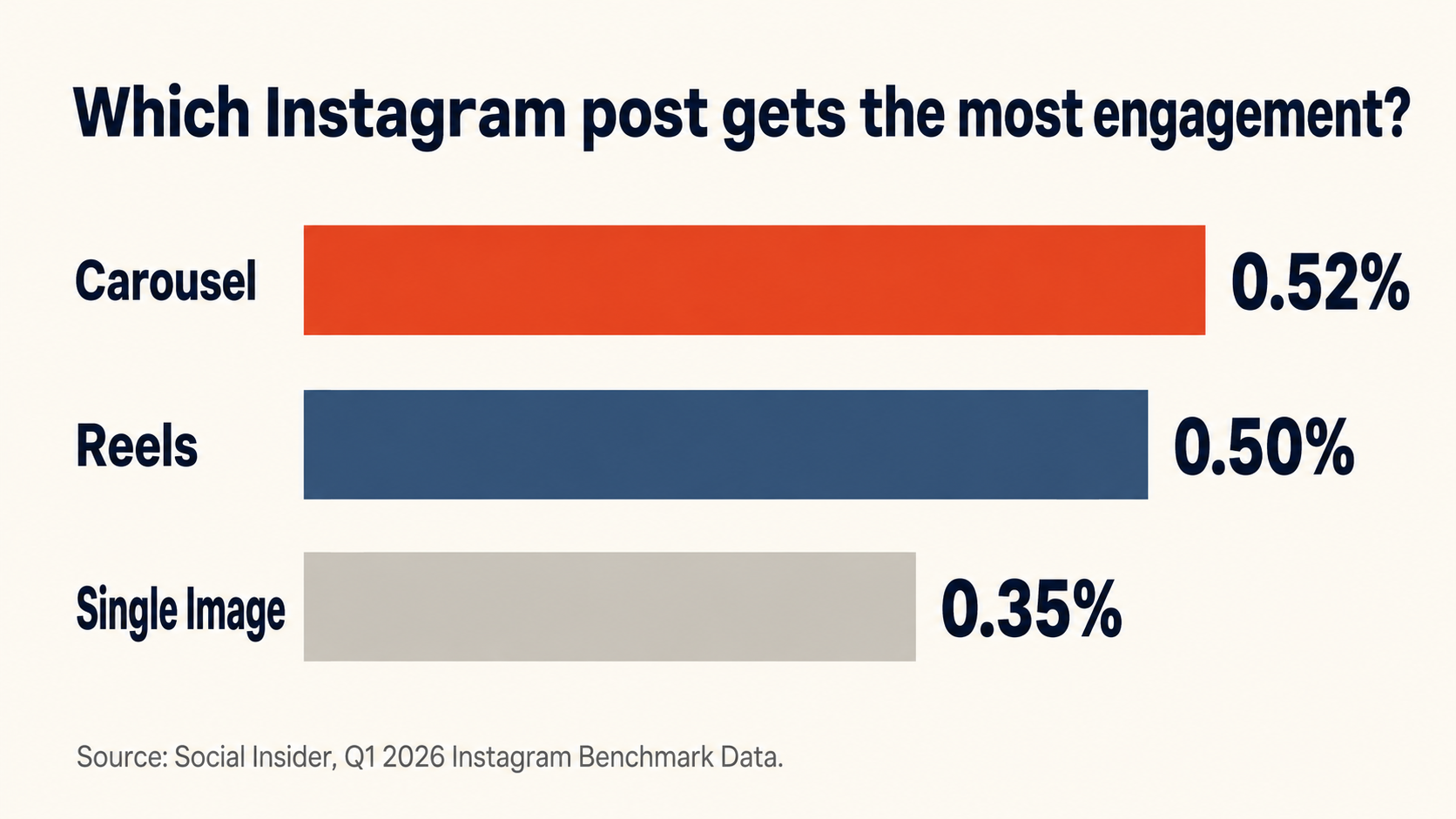
Carousels get more engagement than any other post on Instagram.
Social Insider's Q1 2026 benchmark data shows carousel posts maintaining the highest engagement rate among all Instagram post types, holding steady at 0.52%, while Reels dropped to 0.50% and single-image posts remained flat at the lowest rate of 0.35%. On top of that, carousels lead in overall engagement and generate the highest save rate of any format, and saves are the signal Instagram weighs most heavily when deciding who else to show your post to.
There's one more advantage baked into the format. Instagram shows a carousel a second time to followers who scrolled past without swiping, a re-serve that single images and Reels don't get.
That second chance matters more than most churches realize.
Carousels are the highest-performing format on LinkedIn too.
Social Insider ran a similar study on LinkedIn, and their analysis of 1.3 million posts from 16,645 business pages found that native document posts, which display uploaded PDFs in a carousel format, generate the highest levels of engagement out of all LinkedIn content types.
A separate study backs this up. AuthoredUp analyzed 3 million LinkedIn posts and found document and carousel posts generating 39% more reach and 30% more engagement than the average post on the platform, while only about 5% of accounts post them regularly.
If your church or your pastor has a LinkedIn presence for community partnerships or staff hiring, this is the format most of your peers are skipping.
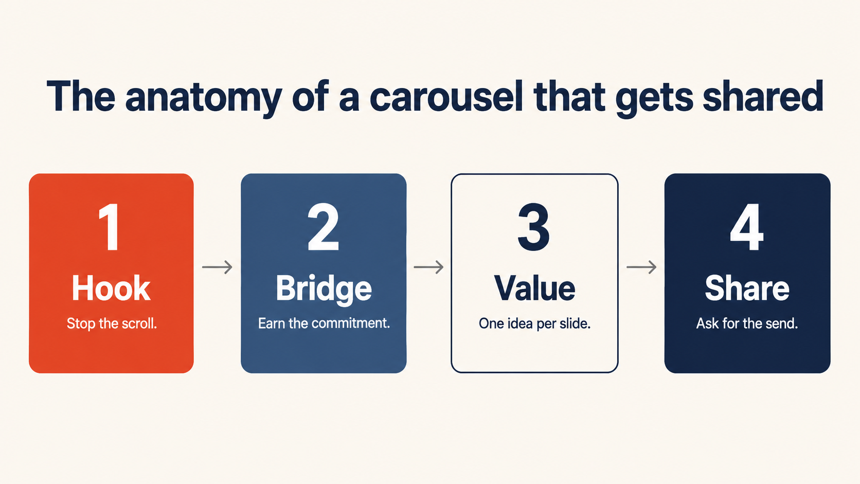
Every high-performing carousel follows the same four-part structure.
Underneath the design, every carousel that performs well is built the same way, whether it's a marketing agency or a local church.
Slide one hooks the right person. The next slide earns their commitment to keep swiping. The middle slides each deliver one idea and stop. The last slide asks for something specific.
Skip any one of those jobs and the whole carousel underperforms, no matter how nice the design looks.
Here's what each slide actually needs to do.
Your first slide has to make the right person stop scrolling.
The best first slides do one job: make a very specific person stop and think, that's me. Your cover should answer two questions instantly, is this for me and what will I get if I swipe, and it should do that in under 8 to 10 words.
For a local church, that means naming your town, your neighborhood, or the exact life stage your reader is in, right on the slide. "5 free things to do in [town name] this July 4th weekend" will always outperform "things to do this weekend," because the first version tells a scroller instantly whether the post is for them.
Use one bold headline, high contrast, and nothing else competing for attention.
Your second slide earns the commitment to swipe through the rest.
Slide one gets someone to pause. Slide two is often more important than slide one, because slide one gets people to pause while slide two gets them to commit to the rest of the carousel.
This is your bridge slide. One line that validates the hook with a specific detail, something like "Friday through Sunday, here's everything worth doing." Its only job is to earn the swipe to slide three.
Get slide two right and the completion rate on the rest of your carousel climbs with it.
Each middle slide should teach one idea and stop.
The slides in the middle are where most carousels lose people, usually because they try to say too much at once.
Treat every slide like a flashcard, not a paragraph. One idea, one line of support, and enough white space that someone can read it while walking to their car.
Skip the "keep swiping" line and let the structure do that work instead. Number each slide, "1 of 4," "2 of 4," or use a small progress marker. When someone sees they're on item 2 of 4, they don't need to be told there's more. They can see it, and that visual promise pulls them through better than any line of text.
Six to ten slides is the sweet spot for most church content. Long enough to deliver real value, short enough that someone finishes it.
Your last slide's best ask is a share with a friend.
By the last slide, you've earned someone's attention for ten to fifteen seconds. Don't spend that on a vague "what do you think."
Ending a carousel with a clear call to action can lift engagement by 20% to 30% compared to carousels that skip one, according to analysis from PostNitro.
For a church account, the highest-leverage ask is a share. A follow reaches someone who already found your account. A share puts your church in front of a neighbor who's never seen it, which is exactly the word-of-mouth reach a church wants in its own town.
Ask directly: "Know someone heading out this weekend? Send them this."
This Saturday is the easiest post you'll make all year.
July 4th lands on a Saturday this year, which means your congregation and your community are already thinking about the same thing: cookouts, fireworks, family, gratitude, home.
You don't need a new sermon idea to make this work. You need one carousel that names your town, speaks to the day, and gives people a reason to share your church's post before they close the app and head to the barbecue.
Below are two exact prompts that you can user right now:
(A) AI prompt to pull real family-friendly events happening near your town this weekend that you can list in the carousel (this is what will help it get saved and shared),
(B) Design prompt to turn that carousel slides content list into a full set of carousel slide images.
(You can use Claude to design the slides, but you really should try ChatGPT Image 2.0 because recently it has been far ahead in terms of design capability)
Both are ready to copy and use today ⤵️ ⤵️